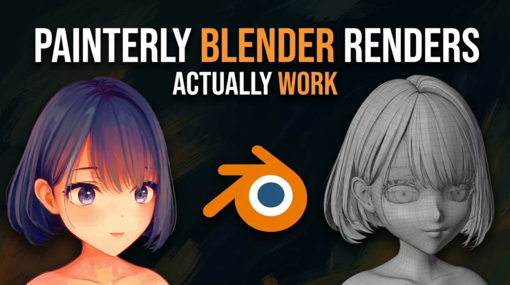
The most striking stylised Blender work shares a specific trick: it reads as a 2D painting when still, and only reveals itself as 3D when the camera moves. Artists like crzyzhaa have built entire portfolios on it.
Getting there is not one technique. It is four decisions, and most people only make one of them.
Why Most Attempts Fail
The usual approach is to keep a realistic render and add a painterly effect on top — a brush-stroke filter, a texture overlay, some post-processing.
It never works, and the reason is that painting and rendering disagree at a more fundamental level. A renderer computes what light does. A painter decides what a surface should look like. Adding brush texture to physically correct shading gives you a photograph with a filter, and everyone can tell.
The painterly look comes from removing physical accuracy deliberately, not decorating it.
1. Flatten Your Value Range
This is the change that does the most and gets skipped most often.
Real lighting produces a huge range from bright highlight to deep shadow. Pastel and gouache work does not — the medium physically cannot produce that contrast, and artists compensate with a compressed, mid-heavy value range.
Compress your shadows. Lift your darks. Pull highlights down. If your render still has near-black shadows and blown highlights, it will read as 3D no matter what else you do.
2. Kill the Specular
Specular highlights are the single most 3D-looking thing in any render. Paint does not have them — a painter implies a highlight with a deliberate light shape, they do not get a physically accurate reflection.
Reduce specular hard, or remove it and hand-place light shapes where you want the eye to go. That decision — where the light goes because you want it there — is what makes an image read as authored.
3. Break Up the Shading With Media Texture
Painted surfaces carry evidence of the medium: paper tooth, brush direction, pigment settling unevenly.
The important part is where you apply it. Texture mapped to the object moves with the object and reads as surface detail. Texture applied in screen space stays put as the object moves — exactly like paint sitting on a canvas the subject is drawn on.
That screen-space behaviour is a large part of why good NPR work holds the illusion in motion.
4. Control Your Normals
This is the technical one, and it is where most stylised portraits fall apart.
Cel and flat shading quantise light into bands, so any wobble in surface normals becomes a visible blotch. Cheeks develop patches, jaws catch shadows that make no sense, and a clean model reads as lumpy.
The production answer is authored normals — projecting them from a simplified proxy shape so the face shades like a smooth form regardless of its actual topology. Easy Custom Normals handles exactly this, and our toon shading guide covers the wider setup.
The Palette Decision
Pastel work uses few colours, and they relate to each other. Pick three or four and derive everything from them, including your shadows.
Shadows especially — a physically correct shadow is a darker version of the surface colour. A painted shadow is usually a different colour, often shifted toward blue or violet. Making that shift deliberately does more for the painterly read than any shader trick.
Where Line Art Fits
Some painterly styles use outlines and some do not — pastel and gouache work often has soft edges rather than lines. If you want them, FreePencil2 generates line art in one click, and our line art comparison covers the four methods Blender offers.
EEVEE or Cycles?
EEVEE, usually. Stylised work does not need path-traced accuracy — you are actively removing physical correctness — and the speed matters because this style is iterative. You will adjust ramps and palettes dozens of times.
See our EEVEE vs Cycles comparison.
The Honest Part
None of this is a preset. Artists producing this work well have usually developed personal methods over years, and the shader setup is the smaller half of it.
The larger half is knowing what a painting actually looks like — how a painter simplifies a form, where they place a light shape, which edges they let go soft. That is studied from paintings, not from Blender tutorials.
Native NPR tooling is on Blender’s roadmap, which will make the technical side easier. It will not make that judgement easier, and that is the part that separates the work.
More free stylised tools in the 3DxDEV Library.